My newspaper, in conjunction with a chamber of commerce group, produces each year a tab highlighting several of our community’s up-and-coming young professionals. Shortly before its deadline, we needed a couple of full-page ads to help fill space. So here’s what I put together. The tab was published May 25, 2014.
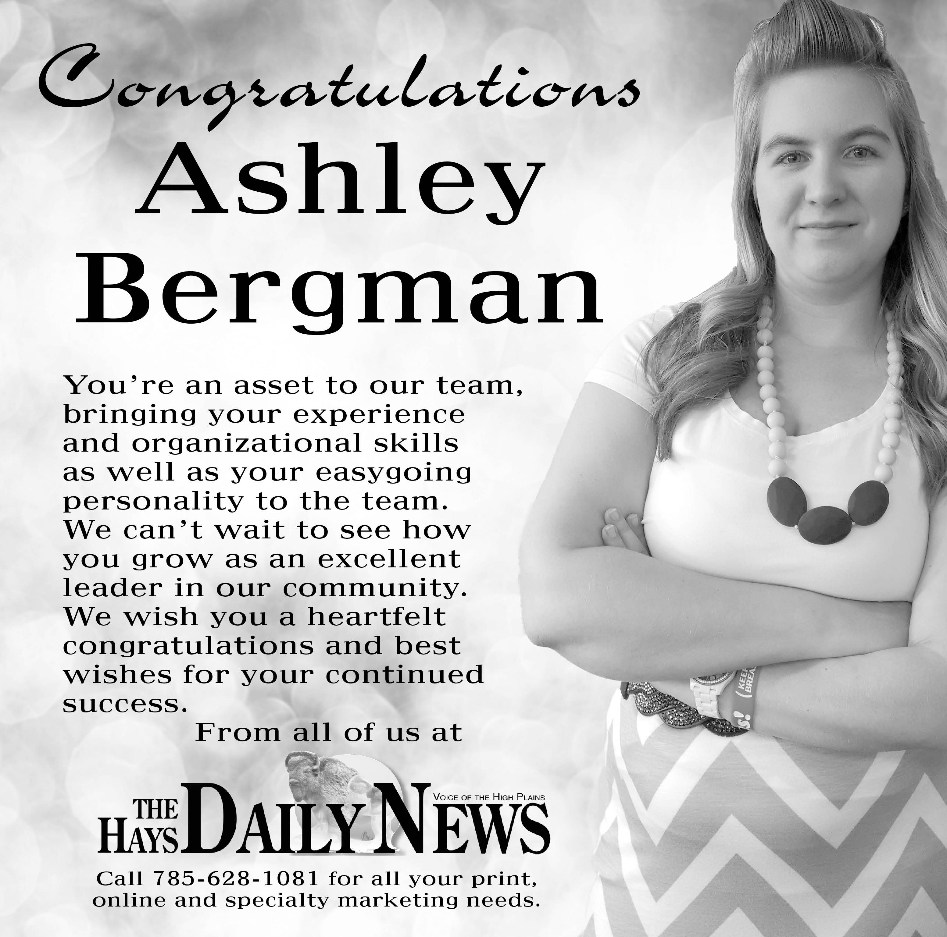 Ashley wrote the copy herself and had the basic concept for the layout on this one. Then she with me at my workstation and we found a background on Thinkstock and a font she liked. I think it turned out well. I just wish this could have run in color, because the teal on her skirt and jewelry really popped and would have looked great. But I’m pleased with the ad as it is, too.
 This is the ad that ran on the back cover. At the time I designed it, I didn’t know if it would run in color, but kept it cmyk just in case. I like the minimalism of it, with that little pop of blue on the men’s ties.
