It’s not often we design logos at the newspaper — usually the clients have already taken care of that aspect of their business. But once in a while, we get the chance to try our hand at it. Here are a couple I got to do recently, and another I enhanced for print.
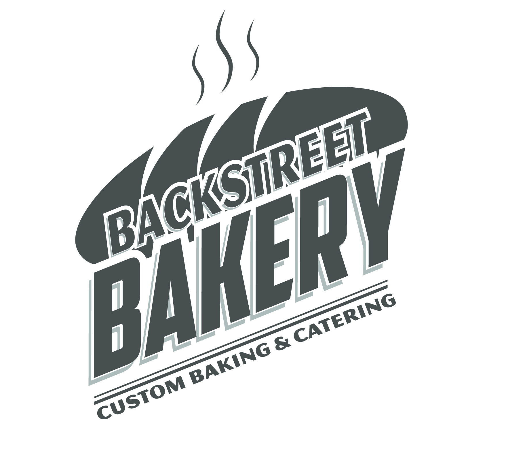
This one is for a small bakery in a nearby small town.
A mall in our town underwent some renovations and changed their name to “plaza” rather than “mall.” They never really redid their logo, so for an annual ad they run featuring all their stores, I put this together. I pulled the colors from a photo of their new main entrance.
![]()
The client actually had created this logo, but it was hand-drawn and given to us on a photocopied grand opening flyer. I scanned it, brought it into Illustrator. I then used the live trace and live paint features to turn it into a vector and to enhance it. The logo still has the client’s hand-drawn feel but has a much better appearance in print.